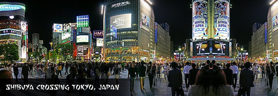
JapanAd
National & International Brand Relationships Outdoor Buying & Planning Service


Expensive Billboard Advertising Mistakes
We all know that advertising is very expensive and very few of us can afford to lose $6000.00 even if it is company money. Below you will find a list of the most costly billboard advertising mistakes and tips to avoid making these mistakes.
- Don’t put a picture of your building on your billboards. The only exception to this theory is if you have just moved or built a brand new location and people have a difficult time finding your new location. I would try to find other ways to direct people to your business like "Next to Burger King" or "Behind McDonald’s". You may also want to put your phone number and website address on your sign.
- Do not use your magazine ad, newspaper ad, or any other type of ad for your billboard ads. Hire a professional billboard artist to design your billboard layouts. A professional can tell you what colors, fonts, and graphics work best on billboards.
- Red words on a blue, or black background is not very visible from average driving speeds. This color combination looks good on paper, in magazines and newspapers, but it is very hard to read on billboards. The red words tend to blend in with the dark background of the sign making it difficult to separate the words from the background. For billboard advertising purposes, red is considered a dark color, and should not be used with other dark colors.
- Using yellow copy on white backgrounds is another costly mistake. The reason for this is that from a distance, the yellow and white tend to blend together and look like the same object. Since both of these colors are light, it becomes almost impossible to tell them apart.
- Blue and white sky backgrounds look great on paper. However, when used on billboards, they tend to blend in with the real sky. A solution to this is to use a sky background that has a sunset on it, or to add pinks and reds to the sky. The goal is to make the billboard stand out and be separated from the real sky. (Of course this doesn’t apply to signs on building.)
- Any kind of fancy script should be avoided for billboards. Fonts with thin letters are also not recommended for outdoor ads. Billboards need to have thick, easy to read fonts in order to be read. Remember that people only have an average of 7 seconds to read a billboard.
- Never use copy smaller than one and a half feet tall because the words probably will not be read by passing motorists. This is not because they don’t want to read your message, but because they can’t see it good enough to read it. Please note that billboards in town, or at red lights are not an exception.
- On a standard size billboard (10 feet to14 feet high) do not use more than 4 lines of copy on your billboard ads. For boards between 15 feet high and 20 feet high, you can use 5 lines, but it is not recommended. A good general rule it to only use a total 8 to10 words on your entire billboard.
- Simplicity is the most important aspect for billboards. The simpler, the better.
- With clarity in the message, design must now be considered. The principle was well expressed by Antoine de Saint Exupery:
- “You know you’ve achieved perfection in design not when you have nothing more to add, but when you have nothing more to take out.”
There you have it, a simple list of the most costly billboard design mistakes. Now you can easily avoid these common
billboard advertising mistakes and several others
by trying this simple experiment.
1. First, take a printed copy of your billboard and put it up on the wall.
2. Then take 20 steps in one direction away from the layout.
3. Now turn around and immediately start walking towards the billboard layout. But be careful and watch where you step so
you don’t run into anyone or anything.
4. Do not slow down when you reach the sign, instead just turn away from the sign.
5. Now stop and think about the layout. You have just viewed your billboard just like passing motorists would see it.
6. Do not look at the layout again and ask yourself the following questions.
Now:
- How clear was the copy (words)?
- Could you read everything?
- Could you tell what the graphics were?
- Did the layout leave any unanswered questions?
- Could you tell what the advertisement was for?
- Did the advertisement make sense?
- Did you remember to tell consumers how to get more information?